Checking for accessibility in content design
Accessibility in content design isn’t just about compliance; it ensures that what you’re saying reaches as many people in your target audience with as much impact as possible.
Conducting accessibility checks on content is an essential part of strategic design and communication. While it ensures that text and imagery are inclusive of those with varying abilities, it also considers situational circumstances like Wi-Fi, brightness and a device operating systems.
Here are three things to consider from our accessibility check process.
1. Environment
As people go about their everyday lives, they’ll see logos on every product and building they come across. They’ll encounter posters and billboards as they walk down the street and experience an influx of information as they scroll through social media and other websites. With so much to see and hear, consider the involuntary processes that help people decide what to pay attention to. For example, something with a lot of small text will take more time to read than a bold, eye-catching image.
Content and advertising are all around us in a variety of settings – some of which may make it difficult to accurately access and interpret. Imagine trying to read an article on your phone in bright sunlight or listening to a video in a noisy café. How does the sun interact on OOH ad placements? If your design isn’t optimised for different settings, users may struggle to understand your ideas.
Considerations
- Colour contrast: Ensure text is legible in different lighting conditions by using high contrast colour palettes.
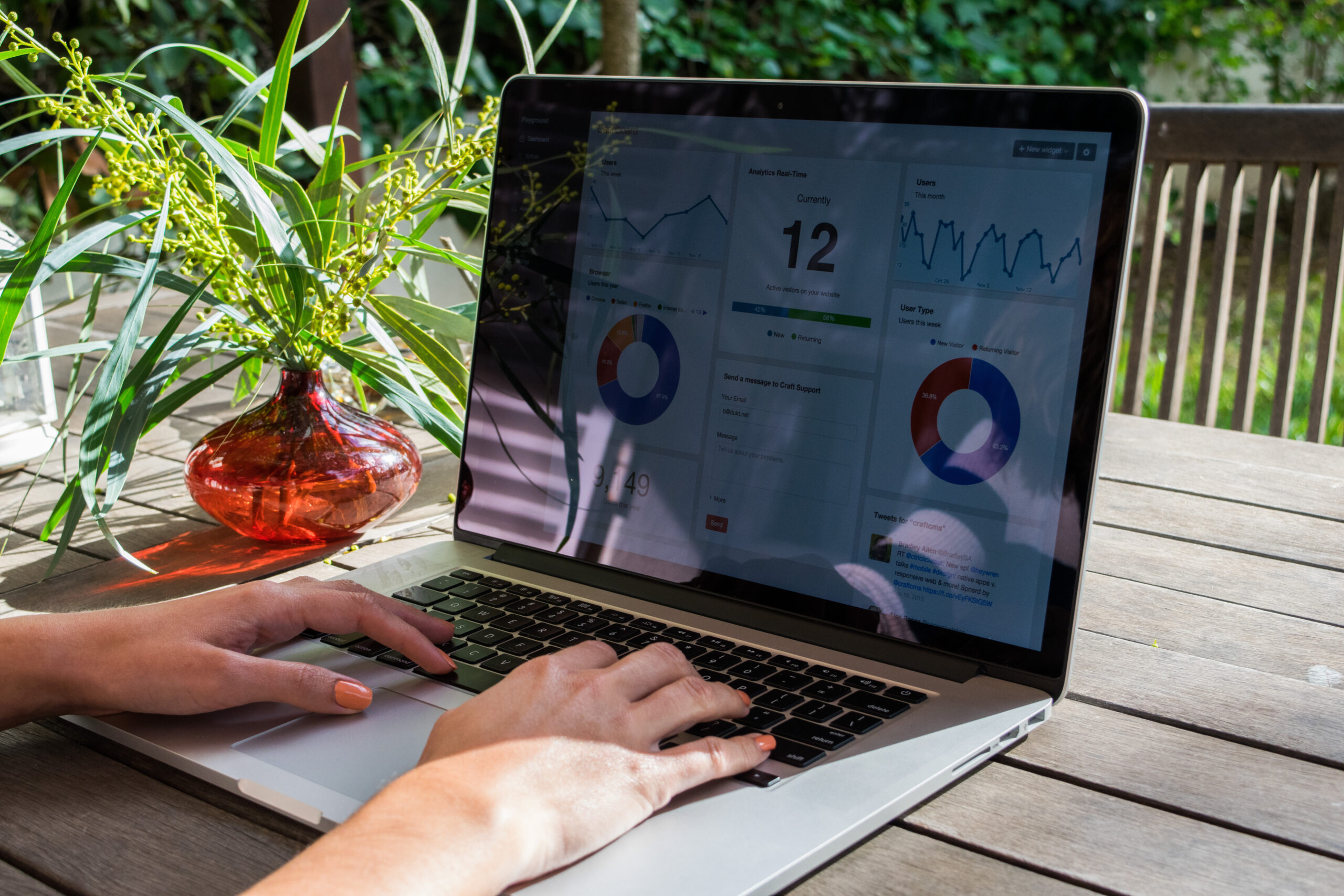
Example: The UK Government’s accessibility guidelines suggest using at least a 4.5:1 contrast ratio for text to background. This ensures readability even in poor lighting conditions. - Subtitles and captions: A common time to read the news, check emails or scroll through social media is during a work commute. People without headphones don’t want to turn their sound on to avoid disrupting others or for privacy reasons, and various conditions can cause difficulty hearing. Including captions so they can understand the content without sound is one way to improve accessibility.
- Online functionality: Can users still access critical information if they have slow or no internet? For digital designs, how long would the whole file take to load? Would elements of the design appear at different times, causing the user to see parts of the content and not others? Reduce file size wherever possible and avoid unnecessary layers.
 The UK Government’s accessibility guidelines suggest using at least a 4.5:1 contrast ratio for text to background.
2. Health
Health conditions can have a big impact on how people read, watch and hear content. This isn’t limited to permanent disabilities—it also includes temporary impairments or neurodivergent conditions.
For example, somebody with a broken arm may use an autoscroll function, which makes it important for text-to-speech scripts to match the timing that the text scrolls. An estimated 10-18% of adults in the UK suffer from trypophobia, a fear of tiny holes. This makes them turn away from designs that feature patterns of small dots and other shapes. Visual elements are not only creative ways to catch attention, but can help people on the autism spectrum and with dyslexia understand information. For example, pulling out key information like metrics or using a speech bubble shape to signify a quote helps provide context and hierarchy to the messaging of your content.
Considerations:
- Screen readers: Ensure your content follows a logical structure so assistive technologies can interpret it correctly. A linear layout is more accessible than a scattered layout. Is any part of your text embedded as an image on digital content? This could keep screen readers from detecting it as text.
- Colour considerations: An estimated 3 million people in the UK are colour blind. Avoid relying solely on colour to convey meaning—use text labels or patterns for clarity. Most smartphones now have a “dark”, “light” and “nightshift” mode, this has a big effect on how colours in different file types appear. Websites need to be set up for codes to shift, depending on the user’s device mode to accurate display colours and imagery. Are interactive elements such as hyperlinks distinguishable from regular text so users know they can click on it?
- Simple layouts: Users with cognitive impairments may struggle with cluttered designs. A clean, intuitive layout improves usability for everyone. Is it clear what different shapes or colours represent in your design?
Tip: Many websites use complex jargon and dense text blocks. Breaking up information with bullet points, clear headings, and simple language improves accessibility for all readers, including those with dyslexia or learning difficulties.
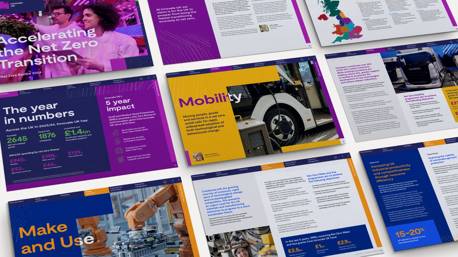 Innovate UK's Net Zero Review highlights metrics with colour and size.
3. Equipment
Not everyone has the latest smartphone or the fastest internet connection. As we mentioned above, some users rely on assistive technologies like screen magnifiers, voice control, or alternative input devices.
Considerations
- Responsive design: Ensure your content adapts to different screen sizes, orientations and operating systems. Would your font or emoji work on both Android and Apple smartphones? What happens to your website when someone uses the horizontal orientation on their phone?
- Zoom functionality: Will users be able to enlarge text without losing content structure?
- Font compatibility: Will your fonts display correctly on older devices?
As a B Corp, it’s a fundamental responsibility to have a considered and strategic approach to the content we create for our clients. Brands that prioritise accessibility in their content design demonstrate a commitment to inclusion and maximise the reach and impact of their communications.
Knowledge is power. Considering accessibility in content design ensures that nobody is excluded from information, education or entertainment, helping move towards a more equitable world.
Checklist
To quickly assess your design’s accessibility, ask yourself:
- Is text legible in different lighting conditions? (High contrast, clear font choices)
- Does your content support assistive technologies like screen readers?
- Are captions and transcripts available for audio/video content?
- Can users navigate without relying solely on colour?
- Does the design adapt to different screen sizes and zoom levels?
- Can users with slow internet or older devices still access key information?
By implementing accessibility as a regular part of your quality assurance process, you optimise your content to be readable and comprehensible by as many people as possible.
Find out how we can support you with strategic content and design. Get in touch here.
Read time
6 minsPublished
March 21, 2025Specialisms & Topics
Latest articles

5 mins

How to level up your brand content with GEO
Find out how to reach your audiences in the age of AI.5 mins

Medtech brand messaging: from complex to compelling
Learn why innovative medtech deserves a bolder approach to communications and content.Share this page